KPI dashboards people actually use
Most dashboards are opened once, admired, and forgotten. The ones that survive are designed around a decision, not around the data that happens to be available.
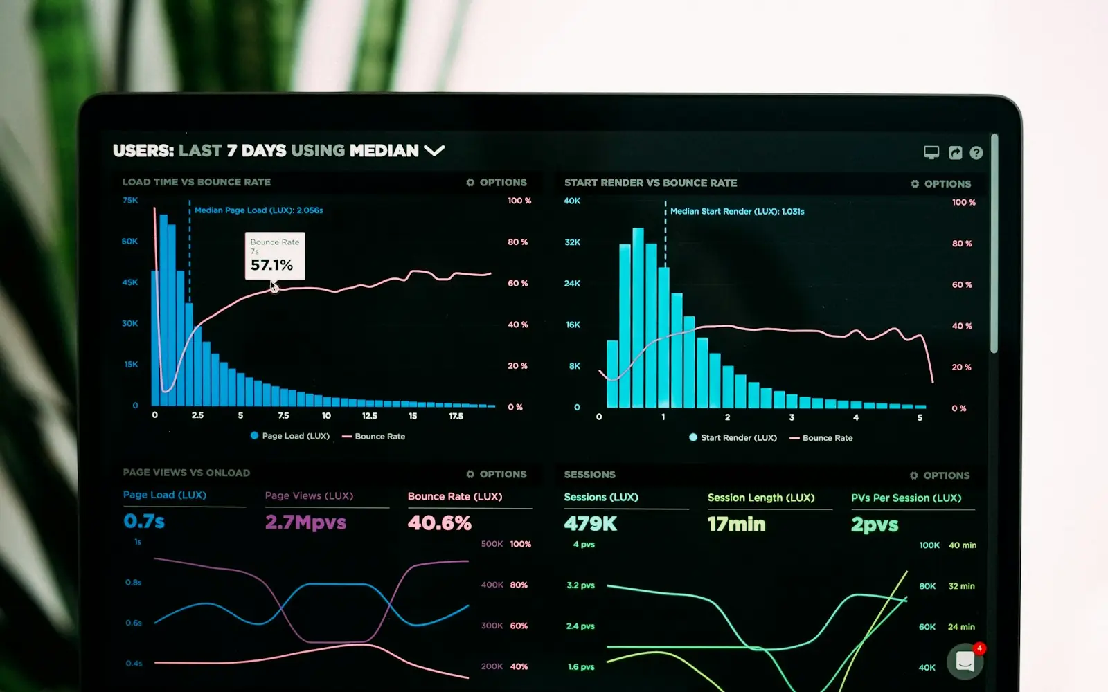
Almost every organisation we meet has a dashboard graveyard: reports that were requested with urgency, built with care, and quietly abandoned a few weeks later. The problem is rarely the tool. Power BI, like most modern BI platforms, is more than capable. The problem is that the dashboard was designed around the data that was available instead of around a decision someone needs to make.
Start from the decision, not the dataset
Before we open Power BI, we ask one question for every page we are asked to build: what will someone do differently after looking at this? If the answer is "nothing, it's for information", the page usually does not need to exist.
A useful dashboard answers a small number of recurring questions for a specific person:
- A restaurant owner on Monday morning: did last week go as expected, and if not, where did it break?
- An operations manager: which orders are at risk of being late today?
- A finance lead: are we on track for the month, and which lines explain the gap?
Each of those questions leads to a different page, a different level of detail and a different refresh rhythm.
Fewer KPIs, better defined
The second failure mode is the "wall of numbers": twenty cards, all the same size, none of them explained. When everything is a KPI, nothing is.
We aim for three to five headline indicators per audience, and we write a one-line definition for each before building anything. "Revenue" sounds obvious until you ask whether it includes VAT, cancelled orders, or discounts granted after invoicing. A definition that everyone signs off on is worth more than any visual.
A KPI without a written definition is an argument waiting to happen.
In practice, this definition lives in the semantic model as a documented DAX measure — one source of truth, reused by every visual — rather than being re-implemented slightly differently on each page.
Design for the glance, then for the question
Good dashboards work at two speeds. At a glance, the reader should know whether things are fine. Only then should they be able to ask "why?".
That translates into a few practical rules:
- Comparison beats absolute numbers. A figure alone means little; against target, last period or the same period last year, it tells a story.
- One accent colour for attention. Everything else stays neutral, so the eye goes where something needs action.
- Drill-through instead of clutter. The detail exists, one click away, on a page designed for investigation.
- Consistent time logic. Every page uses the same calendar table and the same definition of "this week".
Adoption is part of the build
A dashboard is a product with users, so we treat its launch like one. We sit with the people who will use it, watch where they hesitate, and adjust. We track whether it is actually opened. And we plan for change: new questions will appear as soon as the first ones are answered — which is the best sign the dashboard is working.
A short checklist
- Every page has a named audience and a named decision.
- Every KPI has a written definition, implemented once in the model.
- Every number has a comparison.
- The data refresh matches the rhythm of the decision.
- Someone owns the dashboard after launch.
None of this is complicated. But it is the difference between a report that is admired once and a tool that becomes part of how a business runs.
Working on something similar?
We help companies turn problems like this one into working products. Tell us what you’re dealing with.